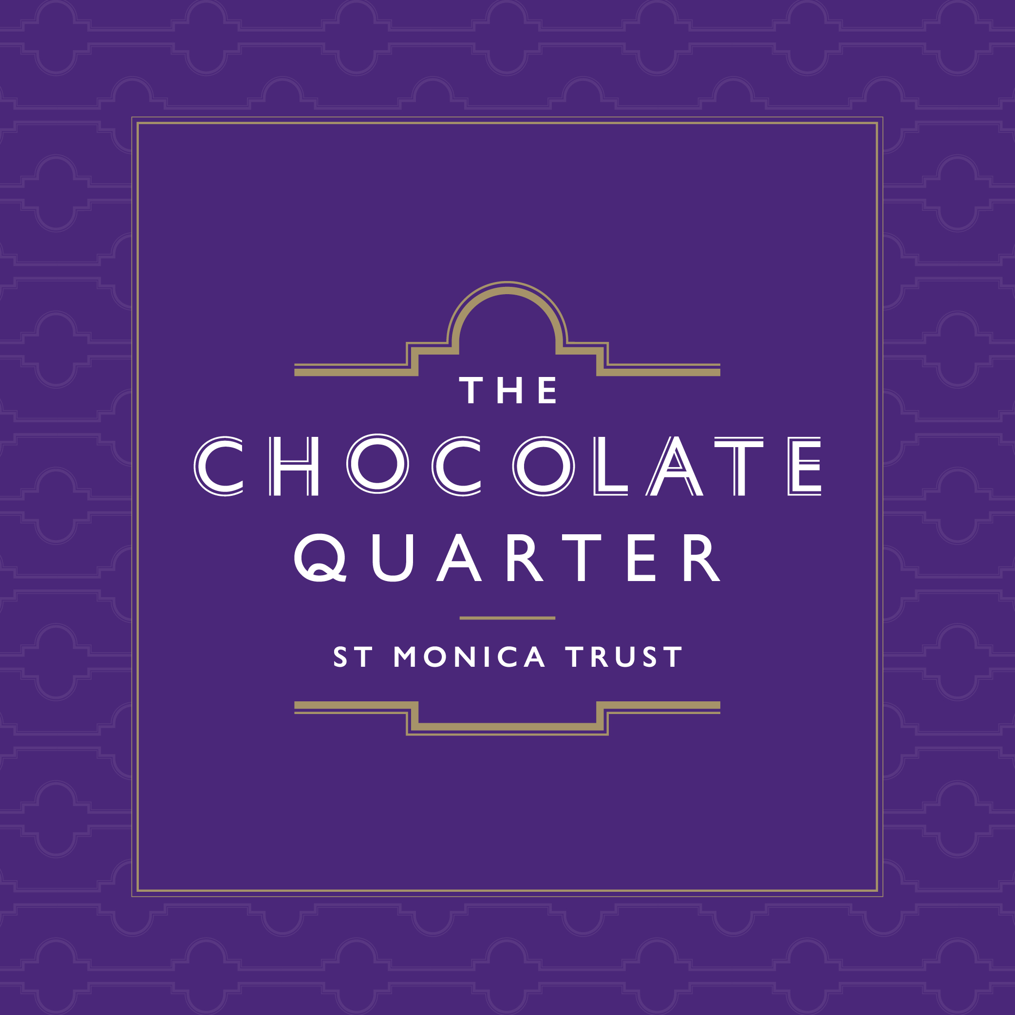
The Chocolate Quarter
St Monica Trust
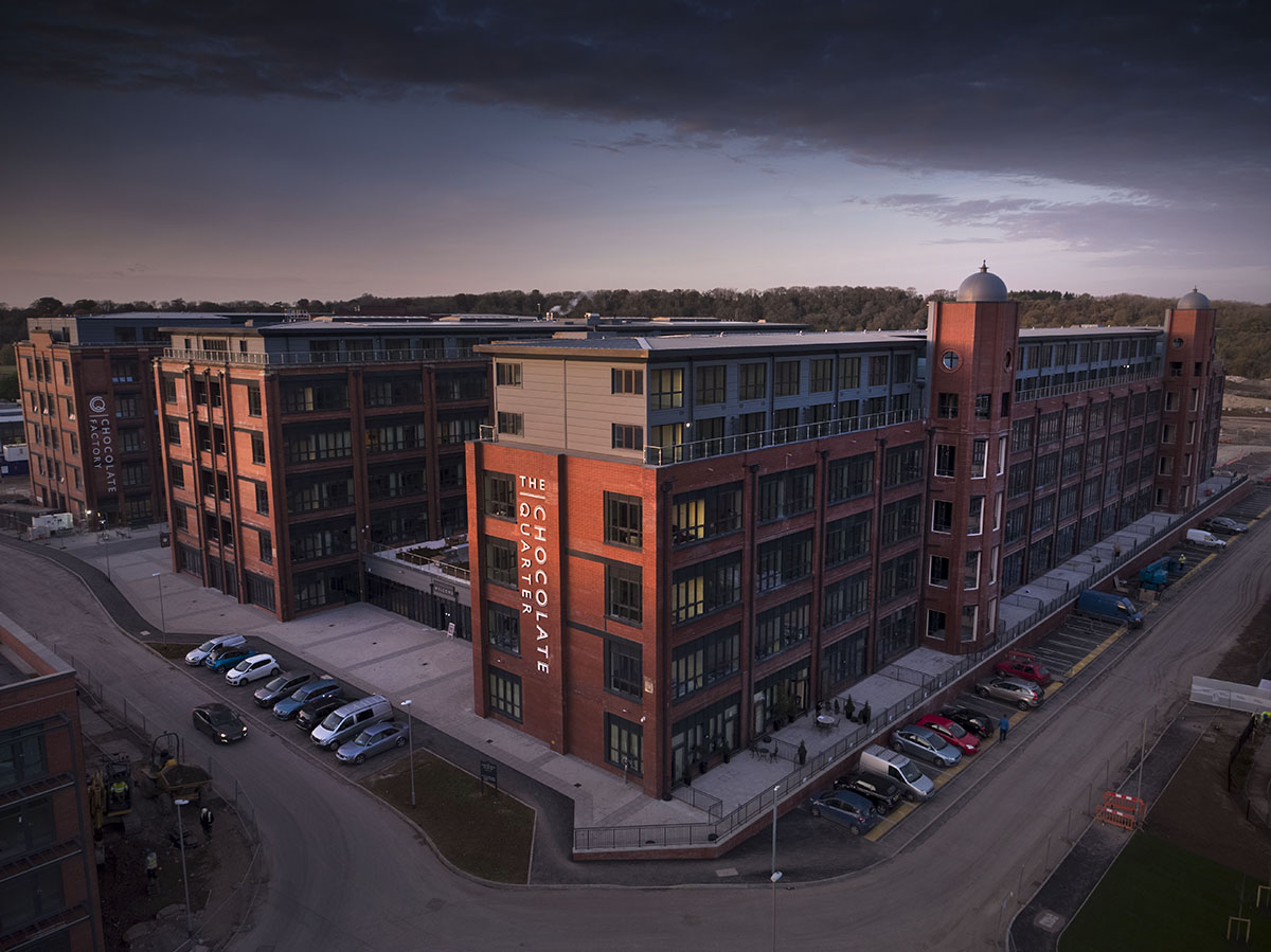
St Monica Trust’s latest retirement village is The Chocolate Quarter in Keynsham. We developed branding for the complex, which was originally Fry’s and later Cadbury’s chocolate factory, along with a website, signage system, brochure and infographic. As well as luxury apartments, the site includes retail outlets, sports facilities, a restaurant, bistro and a range of activity spaces.
The Chocolate Quarter branding
The Chocolate Quarter buildings (originally Fry’s and later Cadbury’s chocolate factory) date back to 1922 so our designs drew on the past for inspiration, using an art deco style for colours, typography and details.
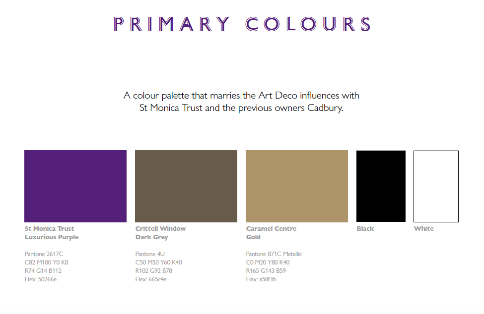
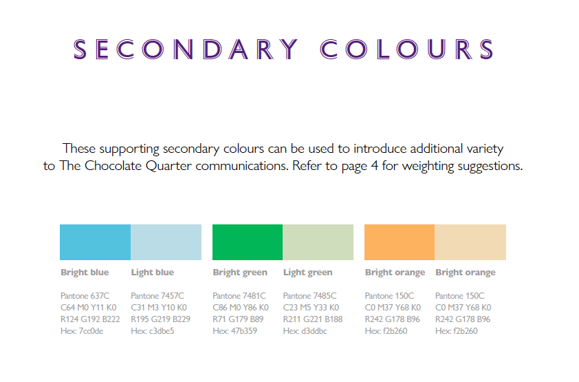
St Monica Trust were keen to emphasise the luxurious style of the new retirement homes, so this has been reflected in the colour palette we’ve used. Rich gold, dark grey and luxurious purple combines art deco influences with current St Monica Trust branding. Meanwhile blues, greens and oranges have been introduced as supporting secondary colours. These will add variety to communications and marketing materials used by The Chocolate Quarter.
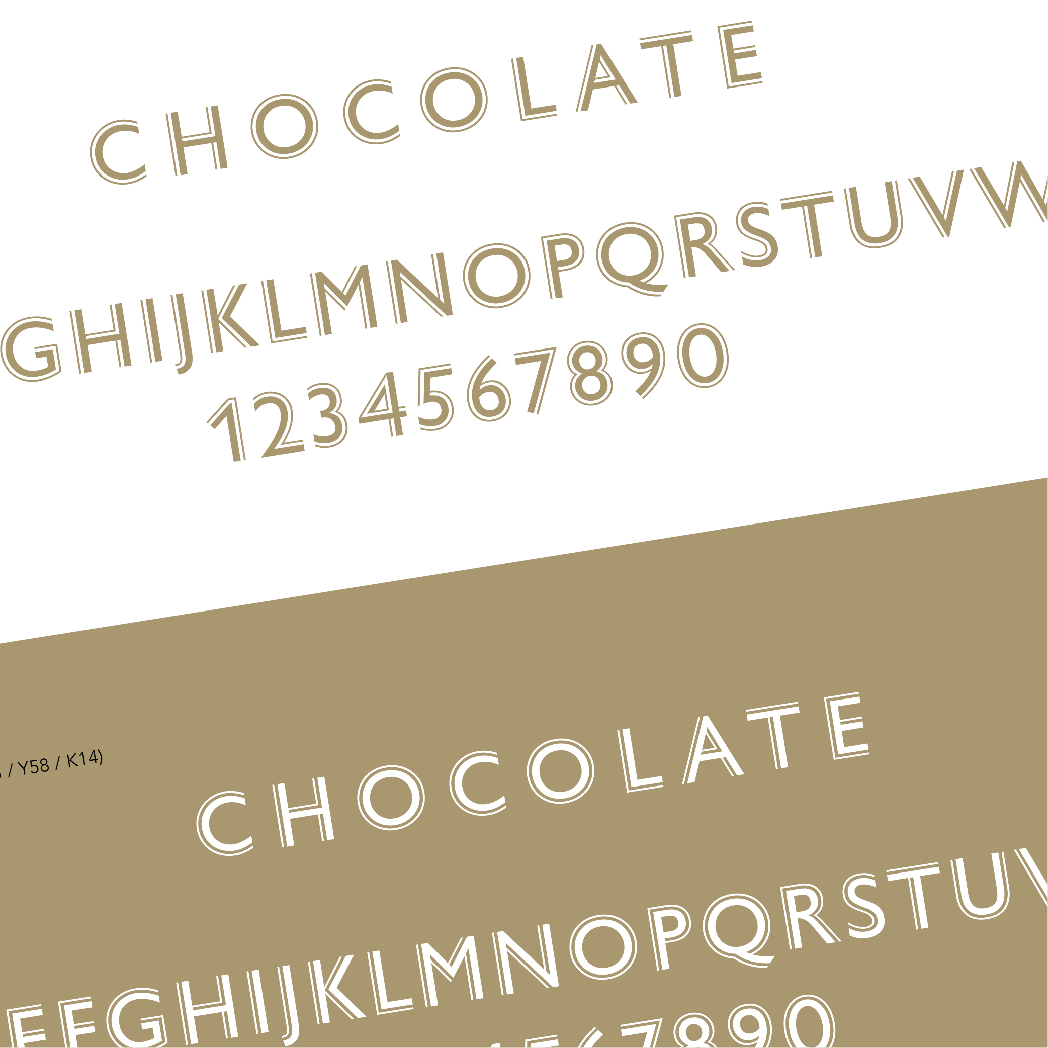
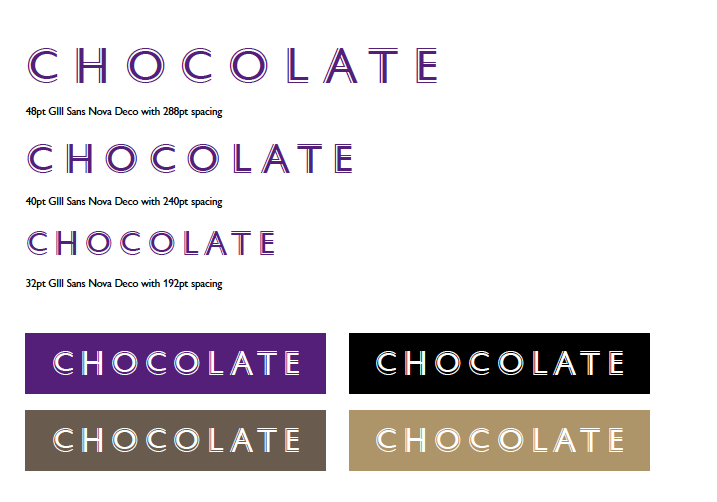
Gill Sans font is currently used in the Trust’s branding so this has been a starting point for the brand typography. Combining the original typeface dating back to 1928 with a more modern look we’ve chosen the Gill Sans Nova collection released in 2015. This is a re-working of the familiar, with the addition of a few new faces. Gill Sans Nova Deco with its decorative ornaments has been chosen as the perfect font for headline use.
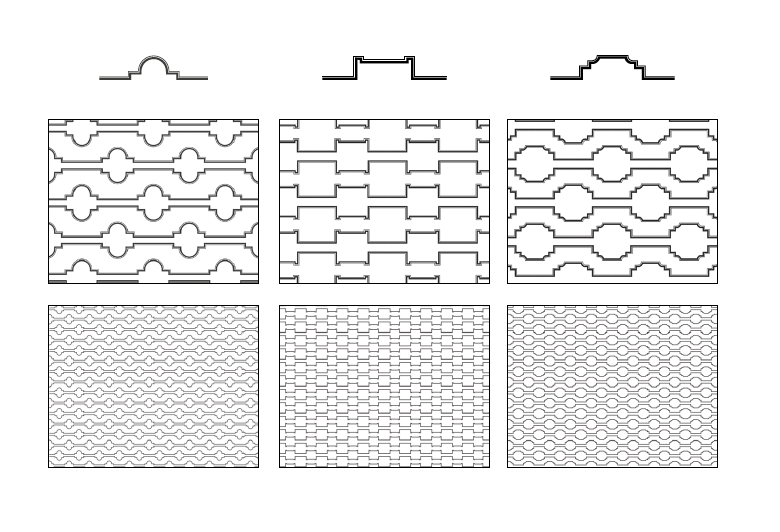
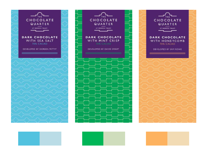
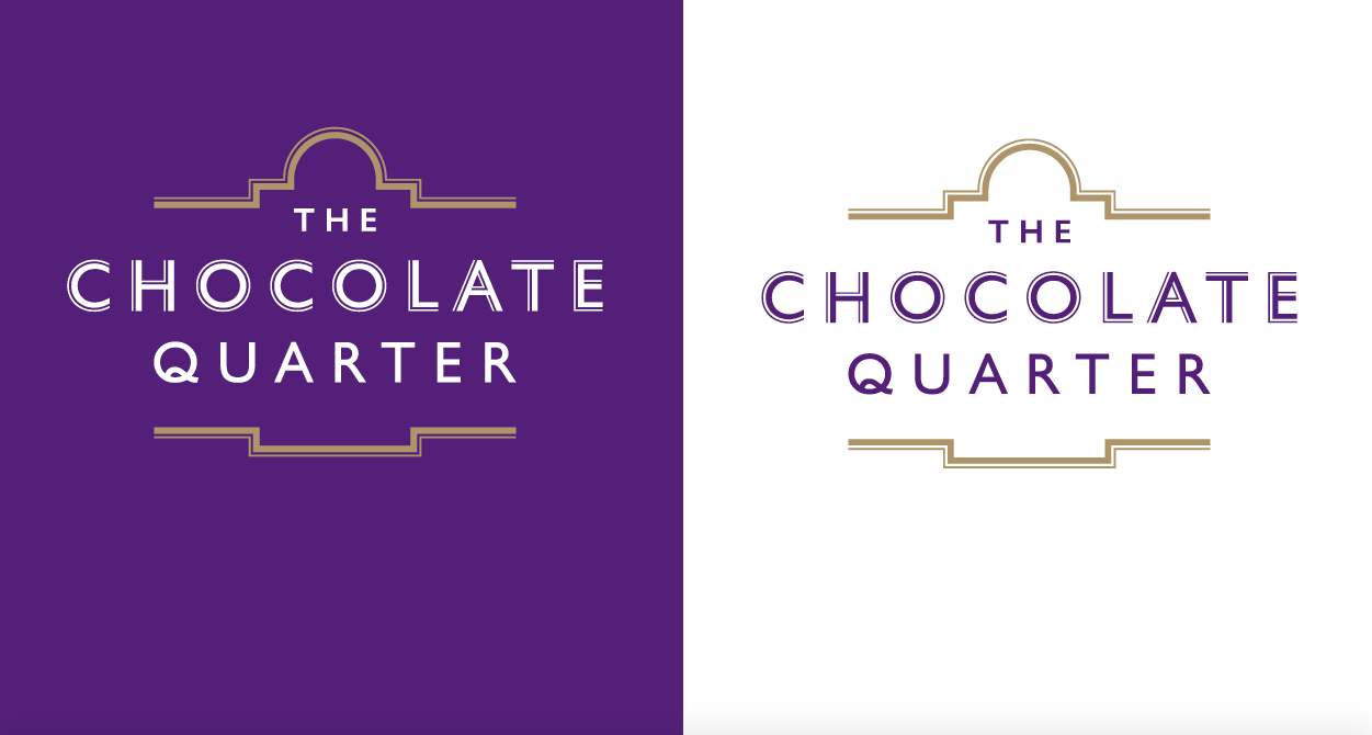
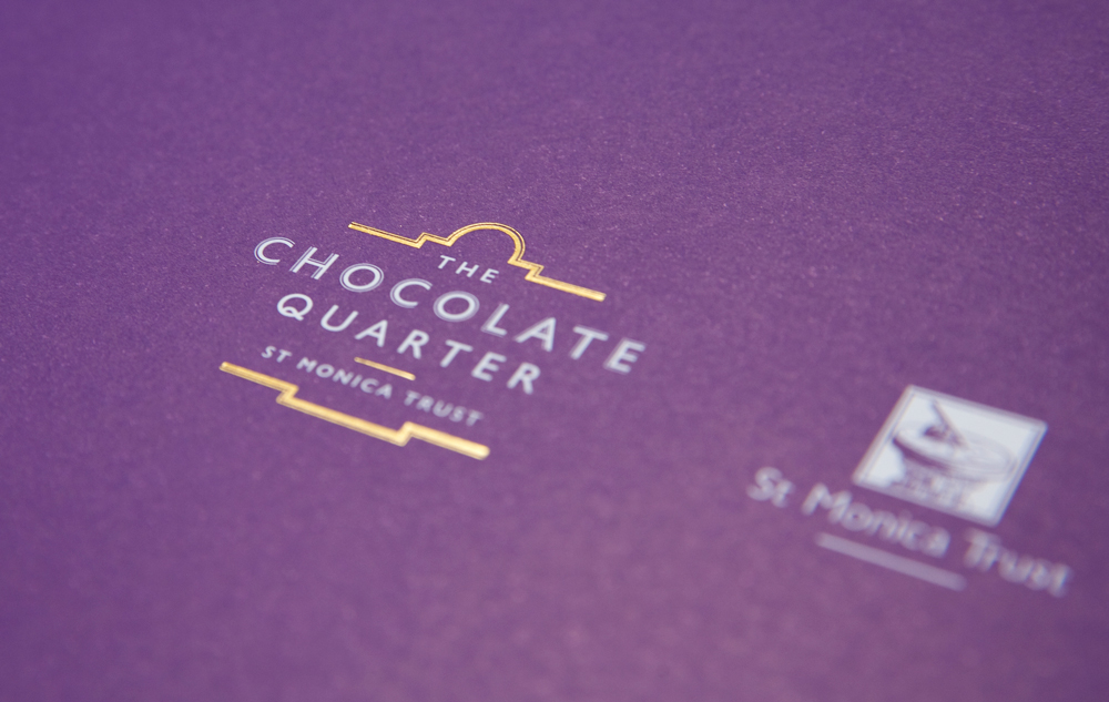
To create the logo we combined Gill Sans Nova with the roof profile of the oldest block in the complex. The complex has three blocks and the retirement apartments will be based in this building. Taking the design one step further we’ve also used the roof profile details of the two other blocks which will make up commercial spaces and a care home, to make three Art Deco inspired patterns.
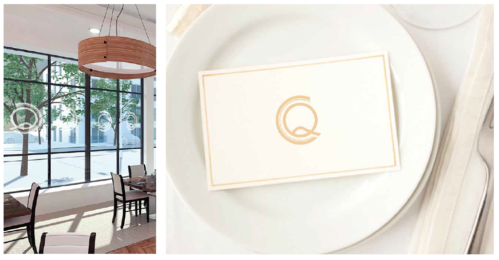
We’ve designed a monogram style logo interweaving the C and Q of the Chocolate Quarter to reinforce the brand and as subtle identifiers throughout the complex. This could be used in the restaurant for example, where the clean, dynamism works well large scale, etched onto the windows. We’ve also suggested different styles and colours for print literature and digital media.
The Chocolate Quarter signage system
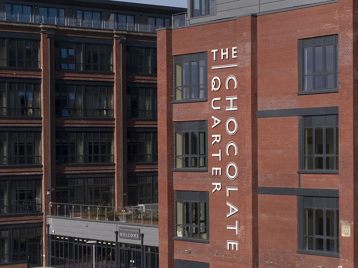
Our main exterior signage for The Chocolate Quarter is made from cut aluminium and our biggest sign designs yet! They stretch to 12 metres high and 2 to 3 metres wide.
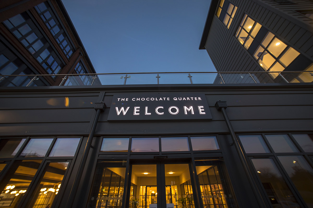
We’ve also designed illuminated welcome signs and exterior wayfinding signs. Meanwhile, the luxurious Brookmead arcade within the retirement community includes art deco style window frosting inspired by our branding along with window vinyls and handpainted style signs on the faux shop fronts.
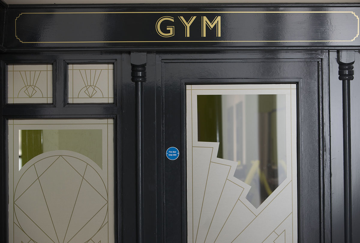
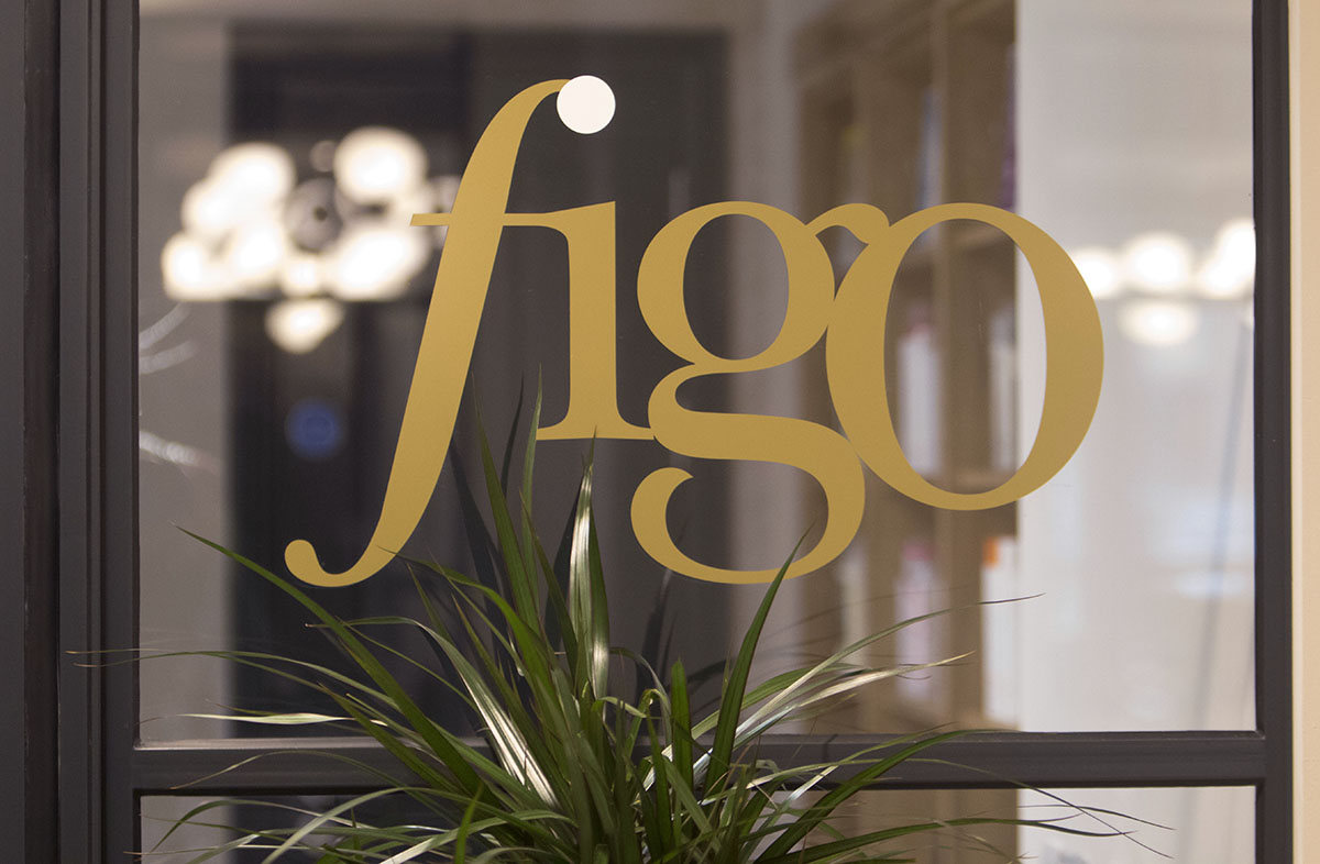
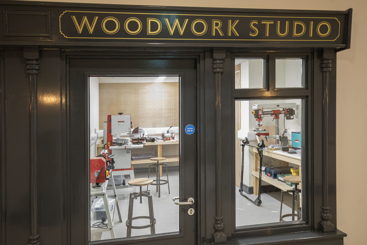
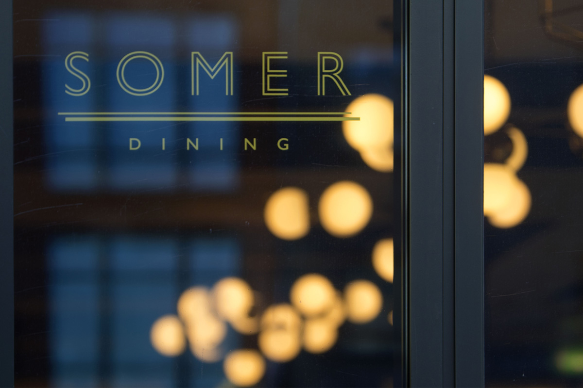
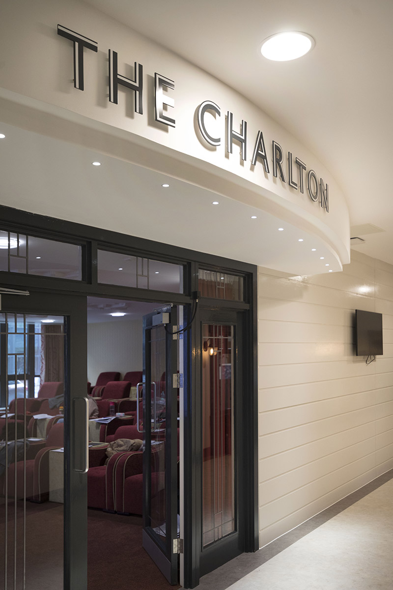
There are plenty of chocolate inspired touches to our signage. In the main reception a wayfinding plinth takes the shape of two shards of chocolate leaning against one another. It includes a removable disc with an updateable directory for the ground floor spaces. Throughout the building the interior wayfinding system is designed to look like pieces of chocolate. The grey colour used for these is in keeping with the industrial style of the crittell windows for The Chocolate Quarter.
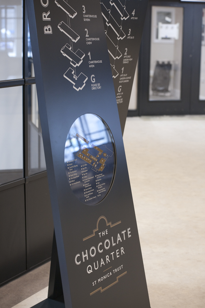
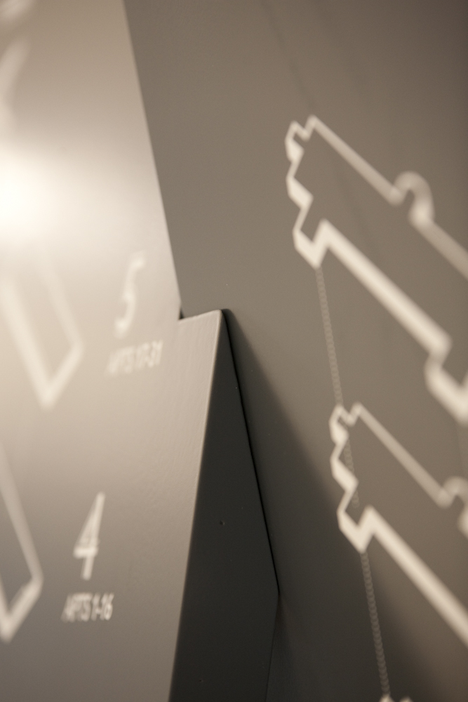
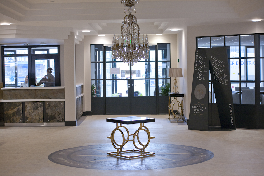
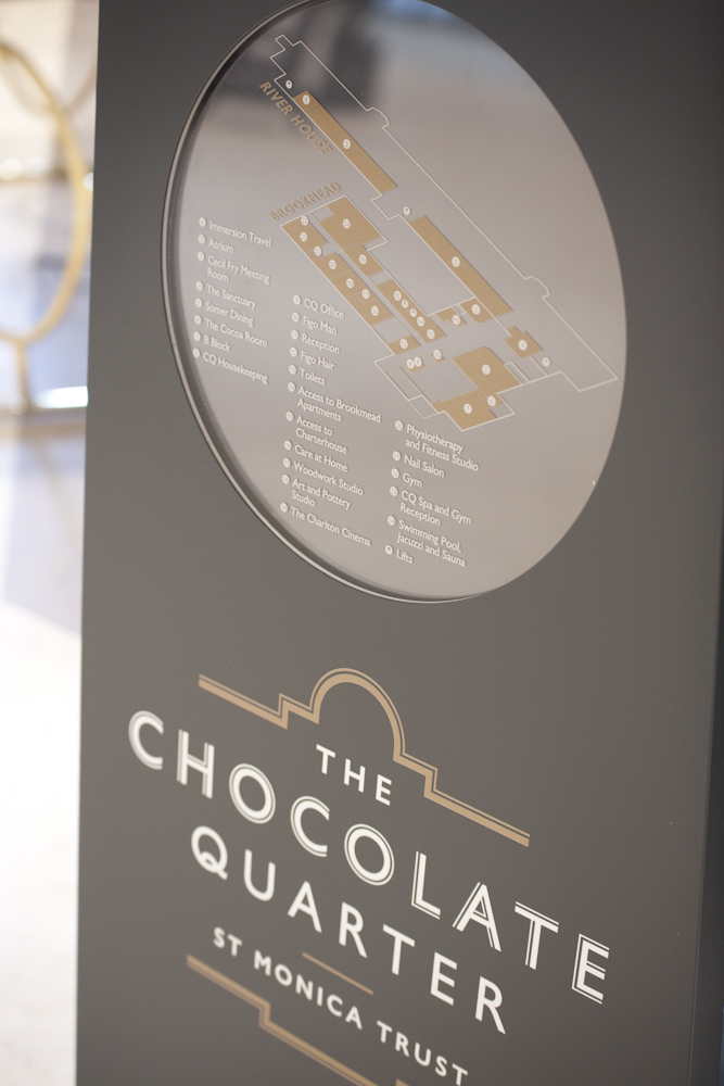
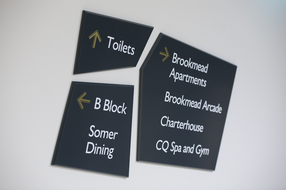
We’re also designing interior signage for The Chocolate Factory which is the commercial building that stands alongside The Chocolate Quarter.
The Chocolate Quarter brochure
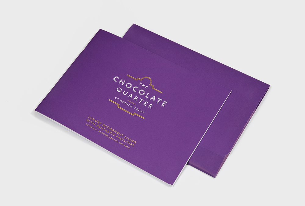
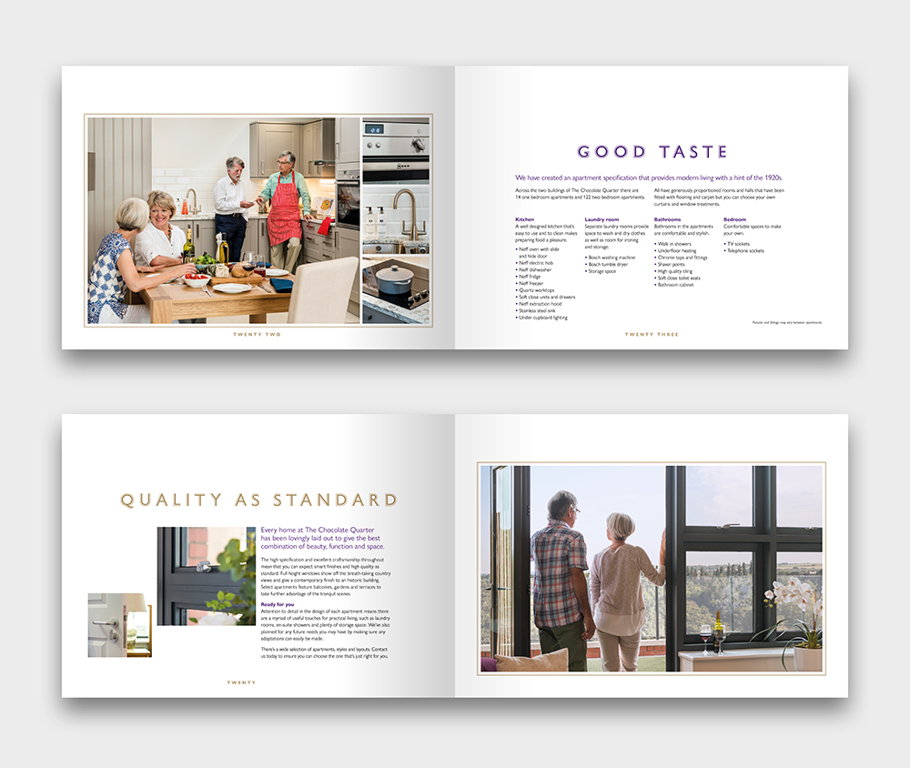
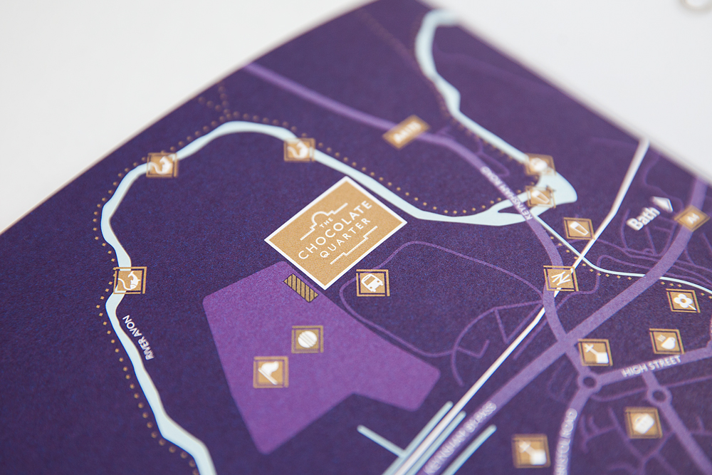
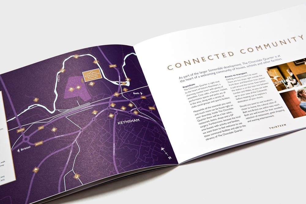
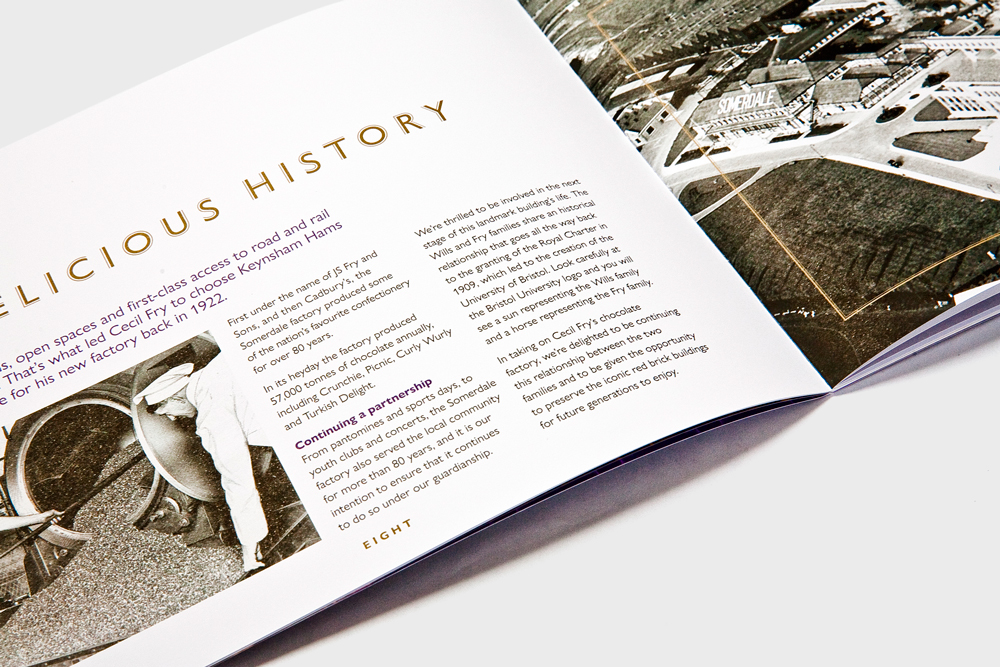
We collaborated with photographer Kenton Simmons to create a twenty-four-page sales brochure for The Chocolate Quarter. This echoes the Chocolate Quarter website (see below) in function and style. Communicating the sense of luxury offered by the complex, rich purple and gold foil has been used throughout along with the Gill Sans Nova family of fonts.
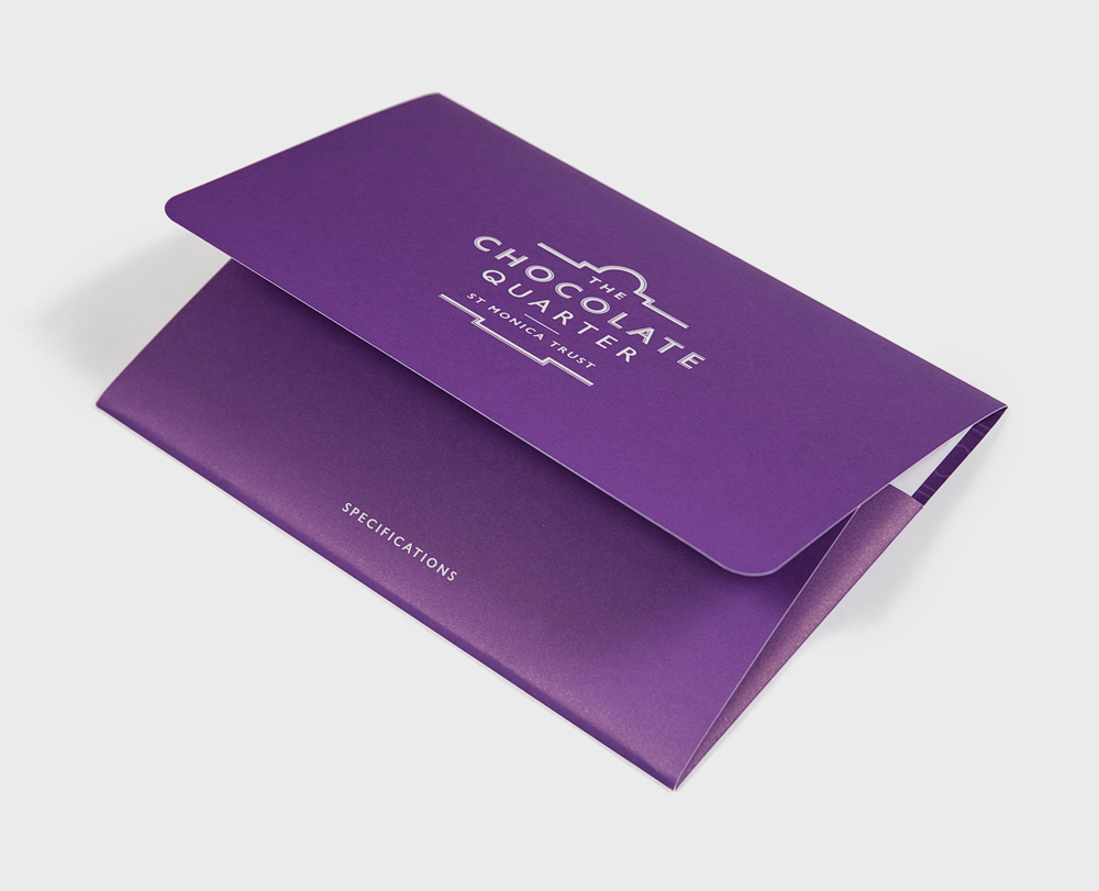
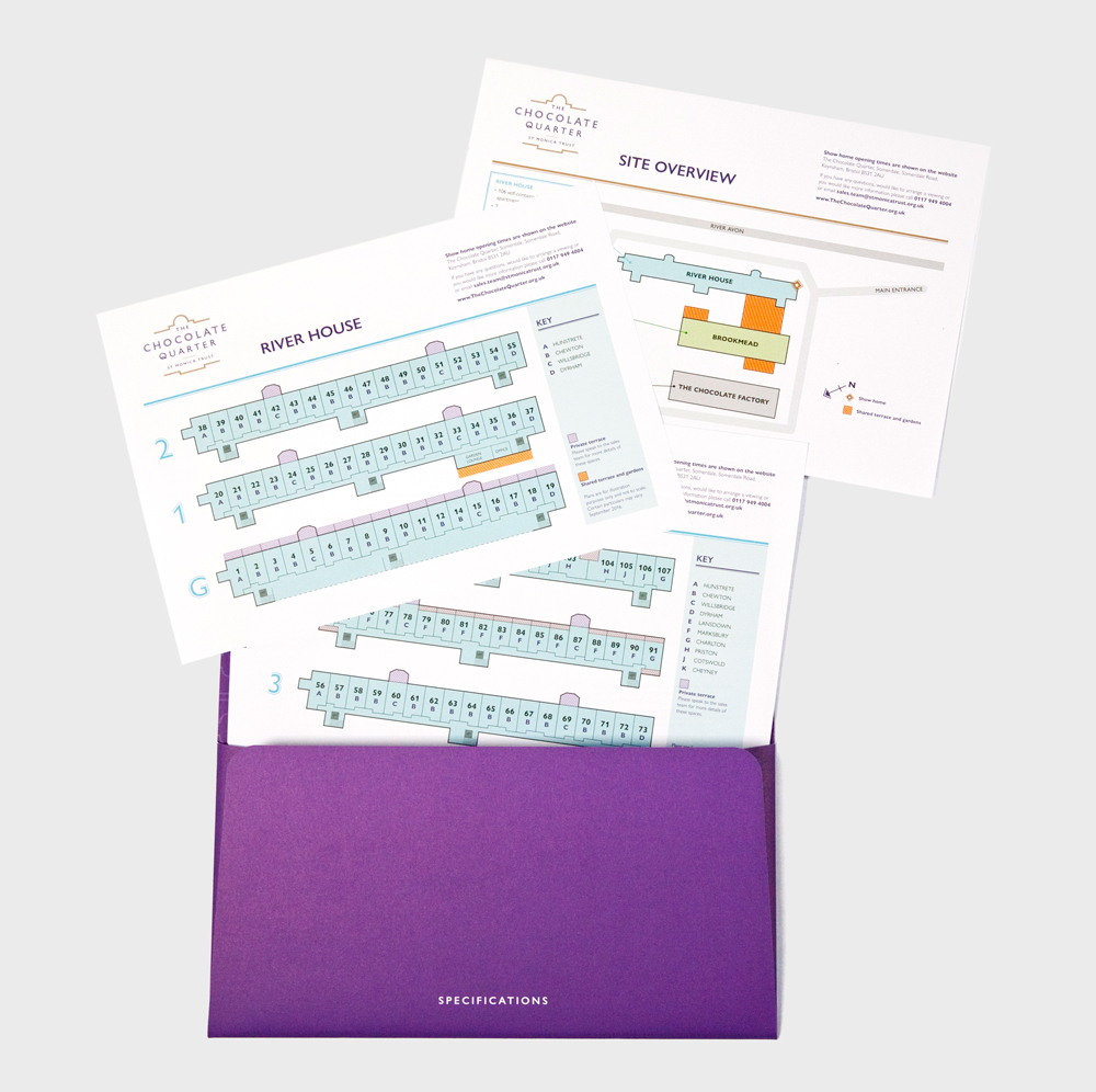
The brochure comes with an A4 sized wallet with floor plans of the range of apartments and various floors.

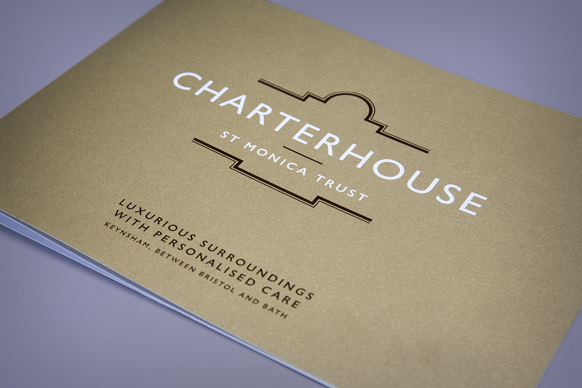
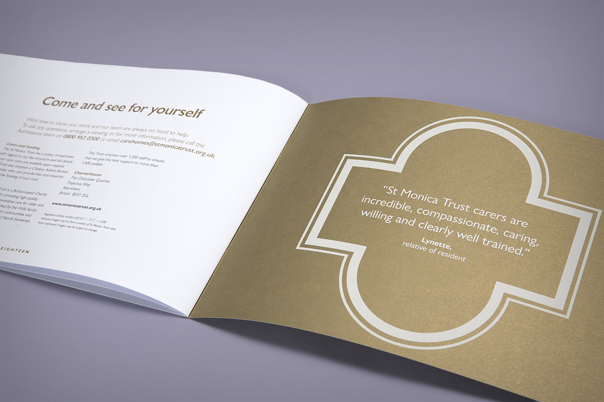
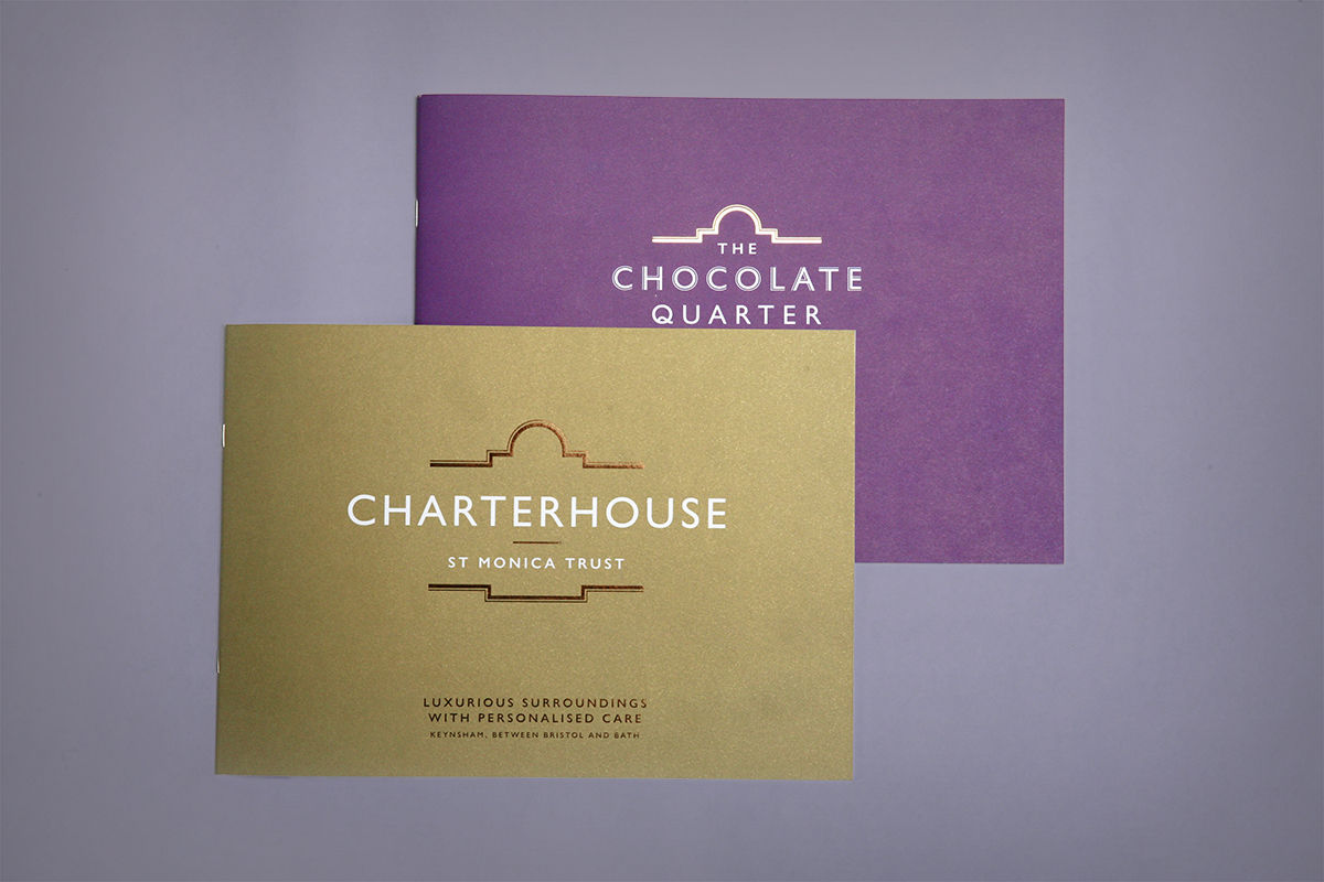
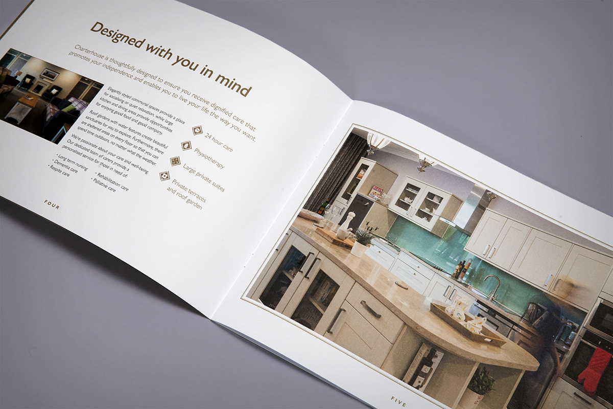
We also designed a separate brochure for the Charterhouse care home located within the Chocolate Quarter. As with the main brochure, the colours and style get across the sense of luxury that the St Monica Trust want to convey for the nursing care aspect of this new retirement community.
The Chocolate Quarter website
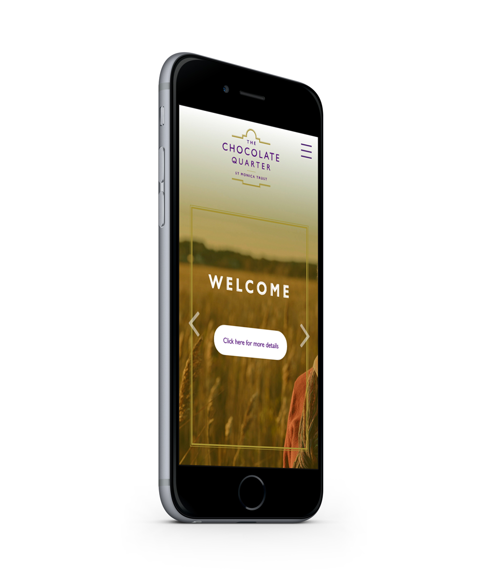
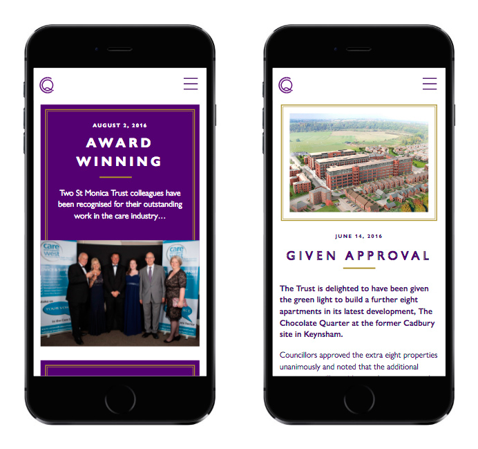
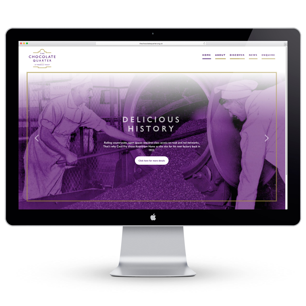
The Chocolate Quarter website provides information on everything from the history of The Chocolate Quarter to details on the accommodation and range of services St Monica Trust offers. There’s also a bit of background on the Trust itself and the award-winning care it provides for its residents.

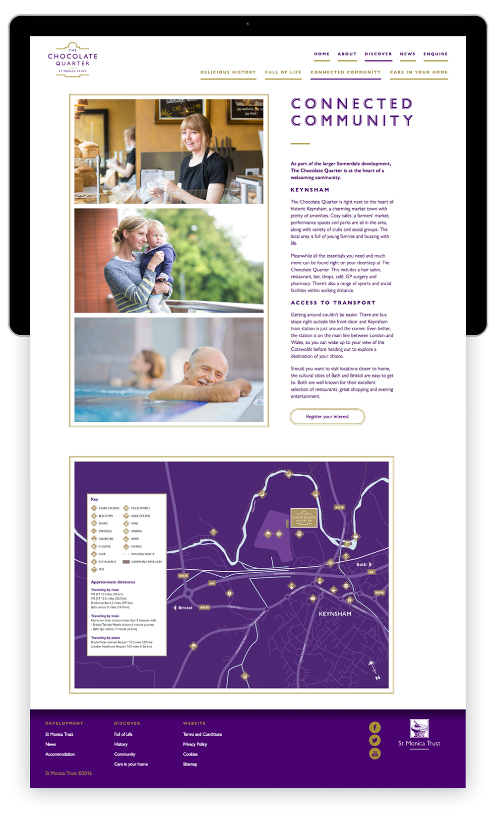
The Chocolate Quarter website has been designed to perform well across all platforms from mobile and iPad to desktop.
The Chocolate Quarter infographic
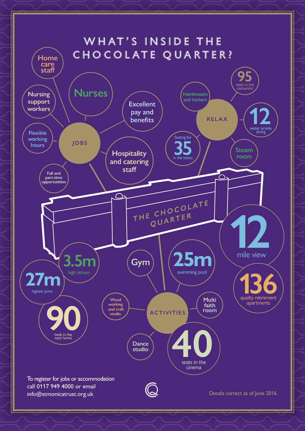
To help market the new community and everything St Monica Trust offers, we’ve designed an infographic that covers all you need to know about The Chocolate Quarter. This is targeted at potential employees as well as people keen to register for accommodation. The A4 infographic will be printed on FSC approved paper and also features more details and pictures of the complex.
