NHS Discharge Communications
Bath & North East Somerset, Swindon and Wiltshire Integrated Care System (BSW Together)
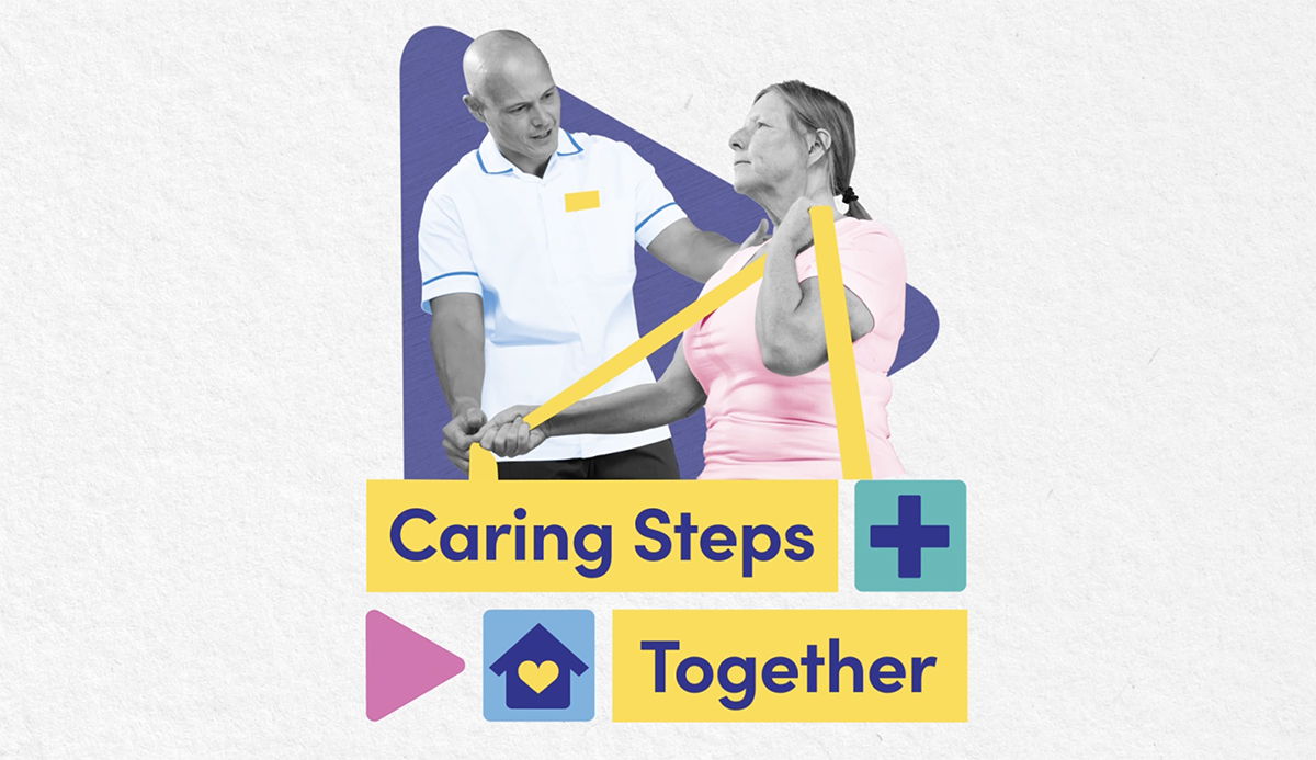
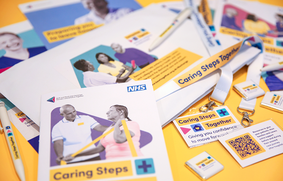
We worked with the Bath & North East Somerset, Swindon and Wiltshire Integrated Care System (BSW Together) to produce styling and tone of voice for a suite of materials aimed at staff, patients, their families and carers. This included printed leaflets, posters, videos and web assets, as well as merchandise for a campaign launch.
Initially, a project group set up by the Wiltshire Integrated Care Alliance was tasked with identifying issues around the discharge communications at each of their acute care hospitals. They found that patients, carers and staff all felt confused about the different discharge pathways for patients moving into appropriate further care settings. Our objective, therefore, was to improve staff engagement and patients’ understanding about the discharge process, which would in turn improve the flow of patients through the hospital system.
Our first task was to create the right tone of voice to apply consistently across all the materials that were needed. To help enable this we drew on the project group’s findings, and consulted existing national initiatives such as the ‘Where’s best next’ campaign. We also sought insights from other similar local approaches nationwide.
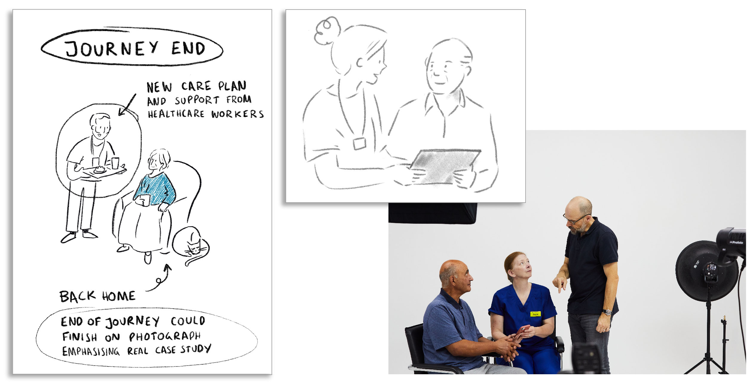
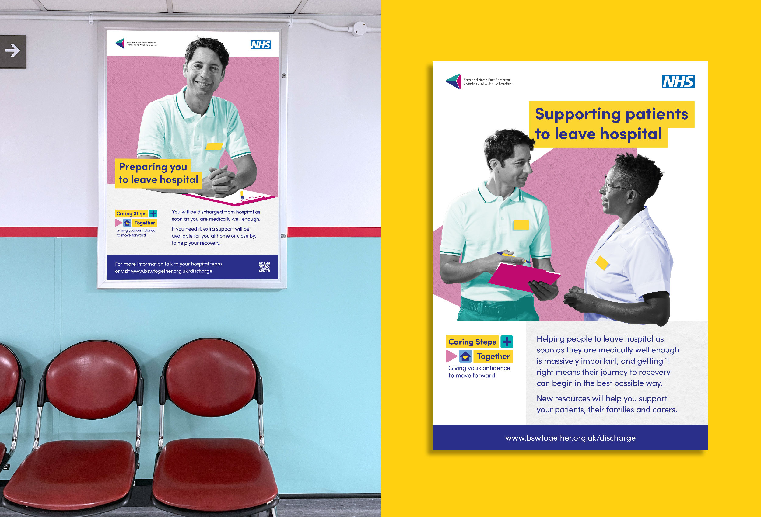
From this research, we established that patients were most successfully engaged by photography that featured real-life situations in hospital settings. This would have entailed finding models and space for a photoshoot within busy hospital environments in Bath, North East Somerset, Swindon and Wiltshire – an approach both expensive and disruptive. Instead we developed a graphic styling that used photographic collage, which allowed us to complete the photography quickly in studio, employing models for patients and staff. To ensure authenticity, a clinician was on hand to ensure that uniforms were correct and that the pictures were representative of real-life scenarios.
“It has been a joy to work with Greenhat. They have worked really well to understand our brief and adapt to feedback received from the project group and key stakeholders. Their approach was insight led and innovative. They worked well with a tight budget and provided excellent value for money across a range of formats.
Whilst they were responsible for the production of key campaign assets, they provided constructive advice and guidance on other areas of the campaign and really felt part of the team responsible for delivering this crucial project to supporting the NHS tackle system pressure. The team have been approachable, friendly and agile and great collaborators.
The creative has been really well received within the BSW system both with patients and families as well as healthcare staff and has already been picked up as national best practice.”
– Gill Kirk-Burgess, Senior Communications and Engagement Manager, NHS BNESSW ICB
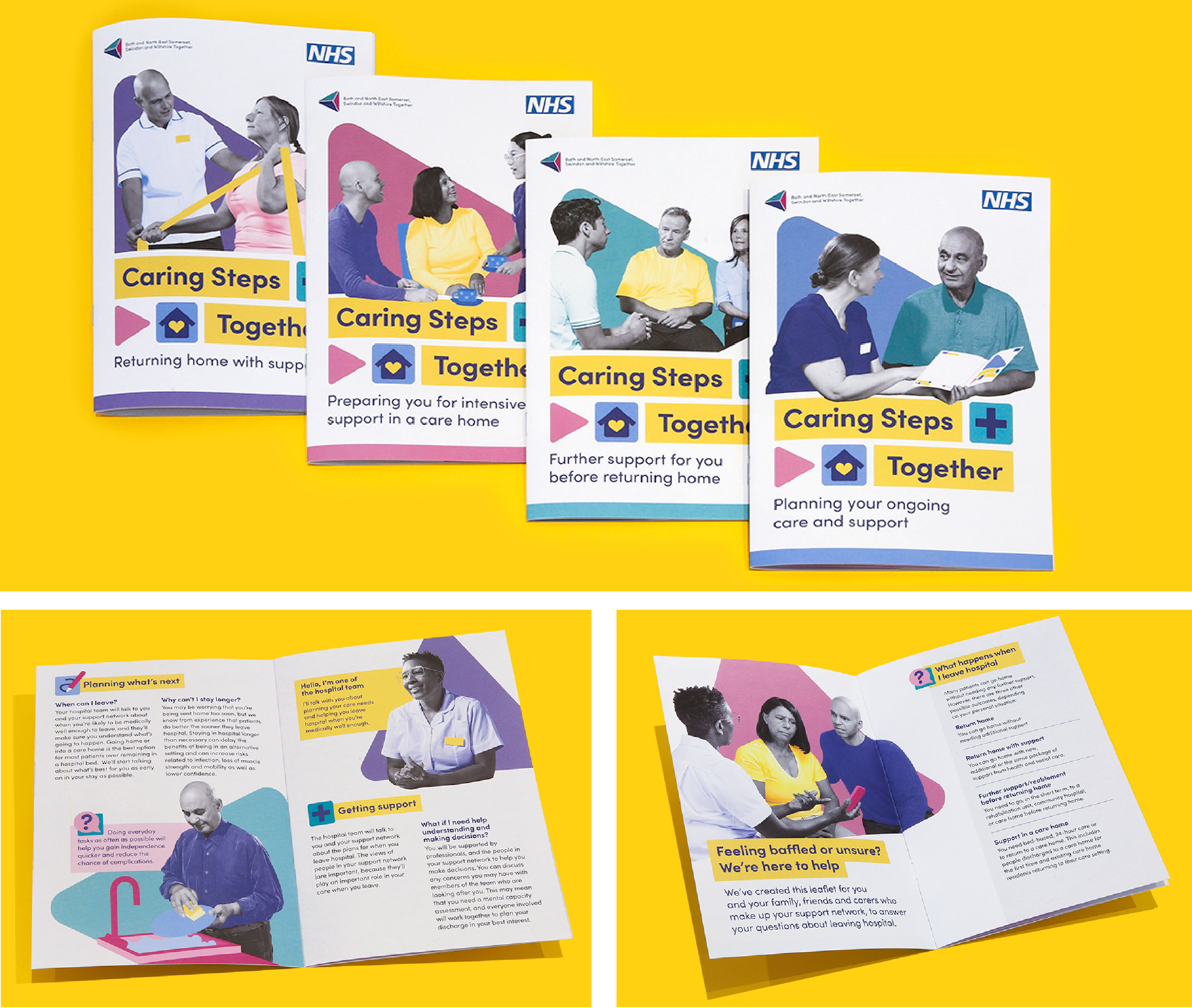
We also followed best practice layout principles developed by the British Dyslexia Association. This led us to create a suite of icons which consistently signpost themes and topics; to place text on light grey backgrounds in order to avoid high contrast; and to use light yellow as a background behind headings to reduce contrast and signify titling.
This resulted in a suite of communications that are bright, colourful and memorable. The collage styling is both eye-catching and practical and allows for a lightness of touch. Overall, our approach conveyed and explained a complicated process in a legible and patient-friendly way.
We created four videos in total for the different pathways to accompany the leaflets. The guiding principles for the campaign can be viewed below. You can see the three other videos here:
We also produced a set of branded merchandise which was distributed to staff during a series of promotional roadshows organised by the project team. These included leaflets, pens, chocolates and lanyards.
