Brigstow Institute styling
University of Bristol
The Brigstow Institute is a new University of Bristol research institute, experimenting in new ways of living and being. Its goal is to bridge the gap between academia and groups such as social enterprises, community groups and members of the creative economy. We designed branding for Brigstow and promotional materials for the new institute’s official launch in 2016.
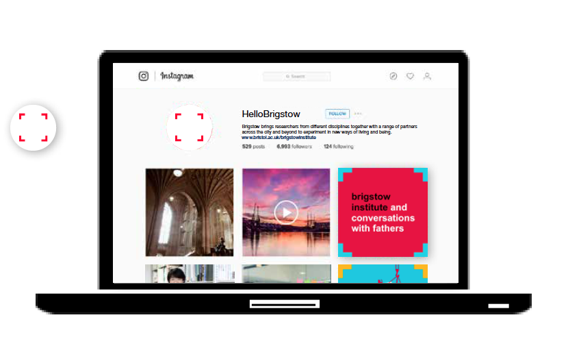
We were asked to create a thought-provoking brand for Brigstow so we played with their idea that the collective is stronger than the individual. The identity we’ve designed incorporates four corners that draw the eye to focus on what’s happening inside the space. When these corners are turned around and different images are joined together they create the plus sign. This symbol echoes the philosophy of Brigstow: that the whole is greater than the sum of its parts. It explores the magic that emerges when ideas are combined.
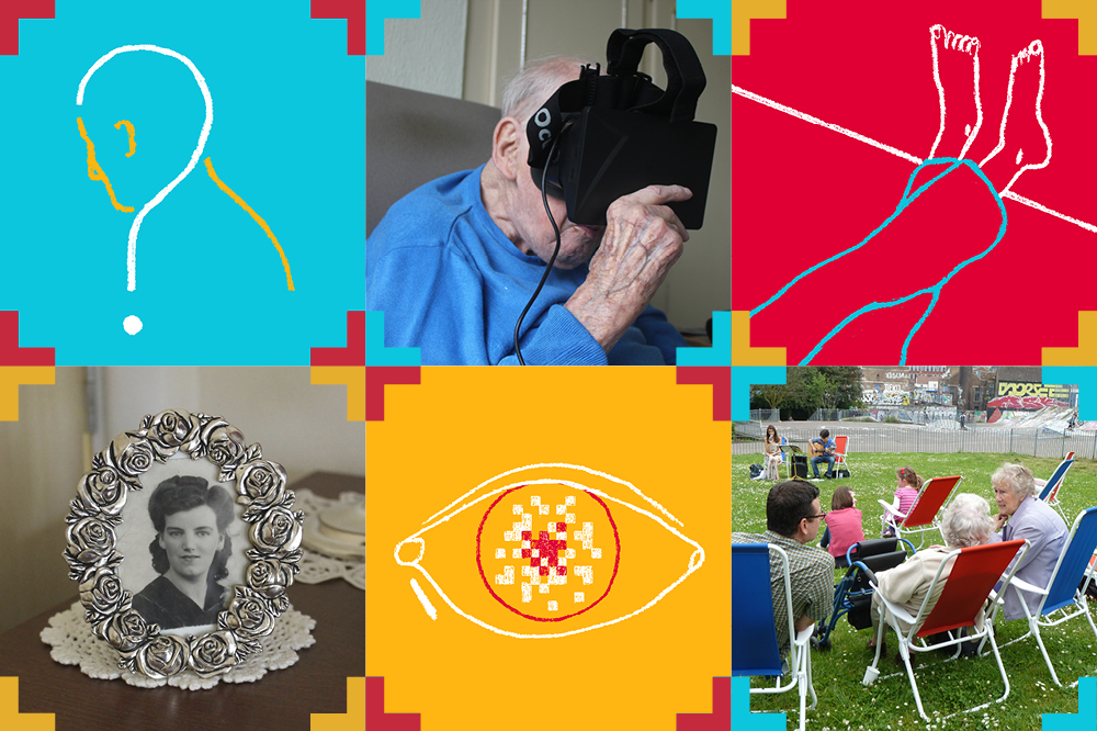
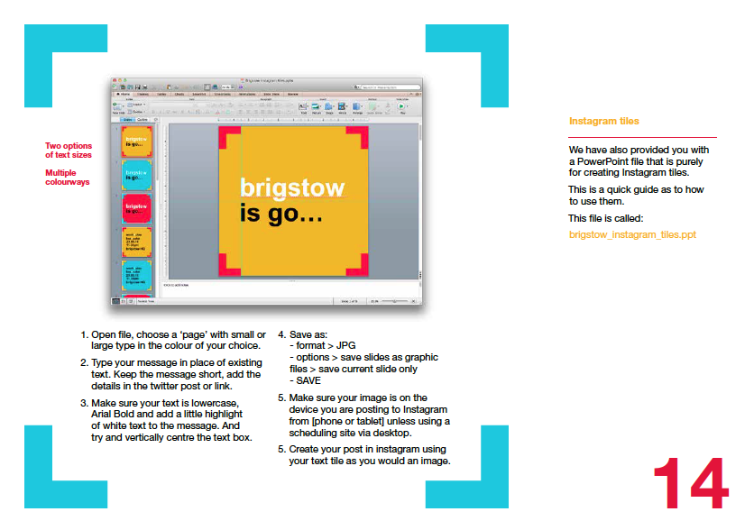
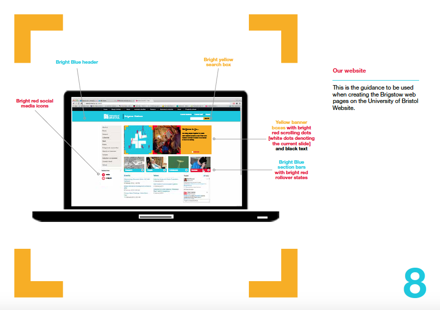
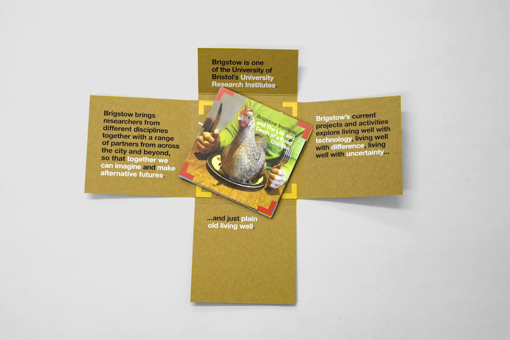
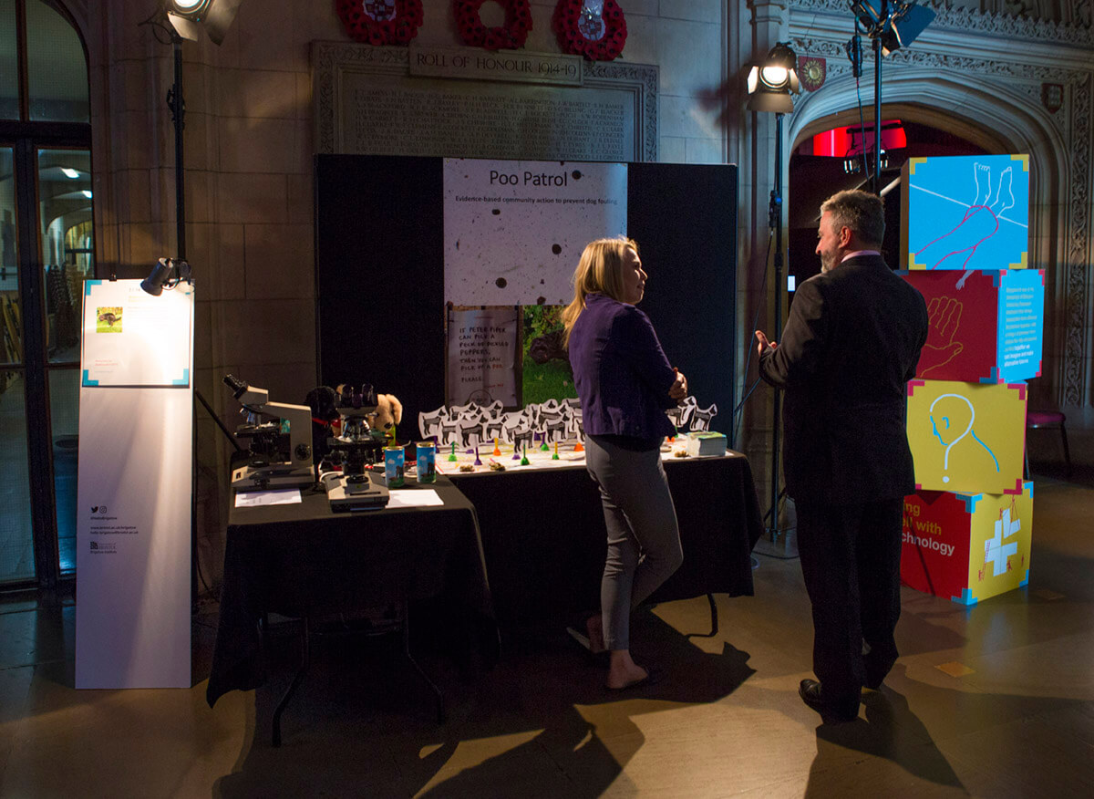
The promotional materials we created for the institute’s official launch included four designs for 500 cm3 boxes. These were made from 75% recycled and fully recyclable cardboard. The card was digitally printed and had photographic imagery along with illustrations we had created and content for the different subject areas. These included ‘living well with technology’, ‘living well with difference’, ‘living well with uncertainty’ and ‘plain old living well’. The bright red, blue and bright yellow colours for the designs were taken from the University of Bristol colour palette.
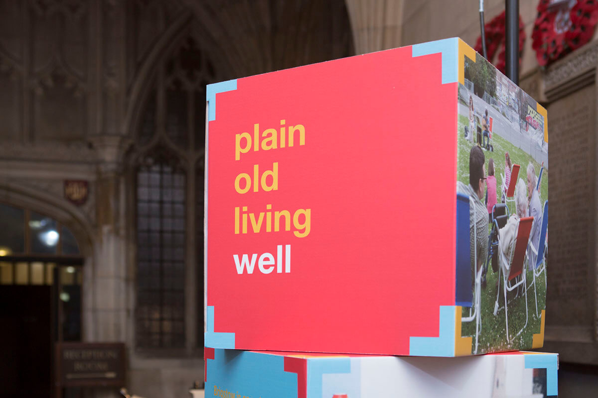
When made up, the boxes created a rigid, lightweight, freestanding display system. The brand has been designed to be quite playful as Brigstow really wanted to stand out and market itself as different from other research institutes. This sense of going against the grain is what Brigstow wants to encourage in the work it does. Embracing play can often lead to moments of genius and Brigstow is different from other research programmes in that it embraces ‘competent failure’. In fact this is a value it actively encourages.
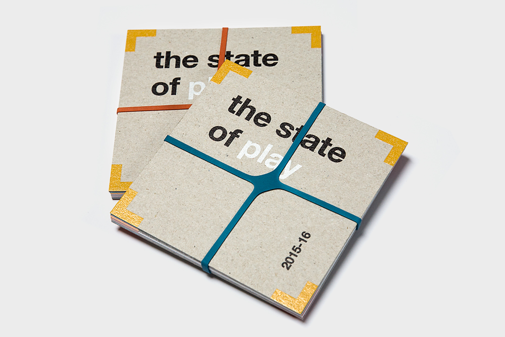
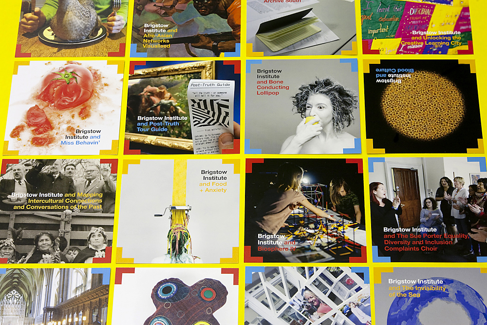
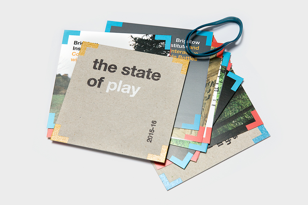
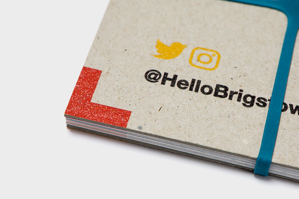
As well as creating box stands we designed a promotional pack to give out to interested parties. These had hardback covers made from heavyweight, recycled greyboard. Inside there were 20 square format postcards relating to each of Brigstow’s new projects and a square format leaflet. These were all bound together using coloured elastic bands, once more touching on the idea of playfulness and curiousity, as well as using unexpected materials.
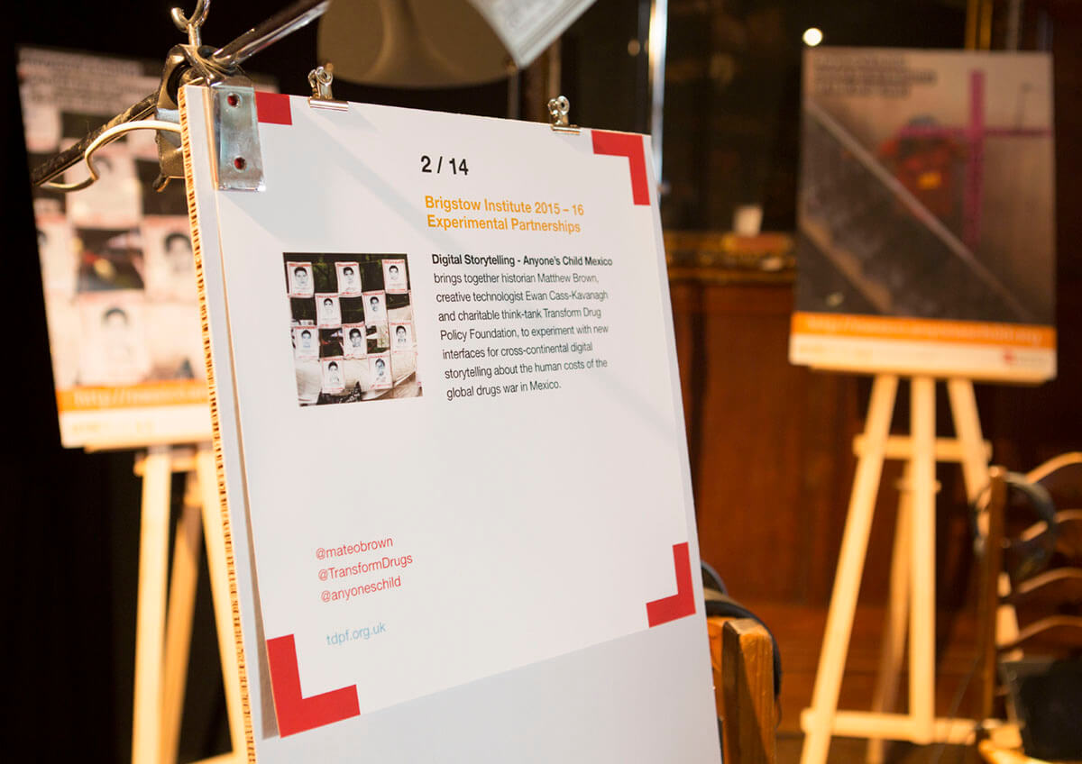
We also created a standee, which could be used as a presentation device for each of the projects. This was again made of recycled cardboard and fully recyclable. Printed bespoke information sheets were clamped to the standees using tiny bulldog clips. The launch, which took place at the Wills’ Memorial Building on 13 October, was a great success and we look forward to finding out more about Brigstow’s exciting projects.
“It’s been a blast! The team at Green Hat have been central to developing the visual identity and materials for Brigstow – creative, talented, responsive and generally wonderful – thank you!”
Gail Lambourne, Brigstow Institute Manager
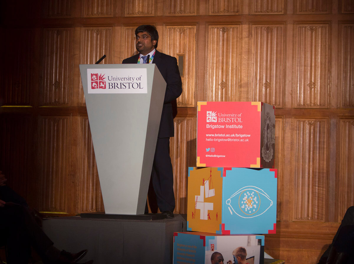
Brigstow Showcase 2017
The Brigstow annual showcase was a fantastic opportunity for the public to explore some of the weird and wonderful research projects they fund. As it took place during half term we were asked to create a leaflet, which wouldn’t just be a handy map for the exhibition but also something that would appeal to families.
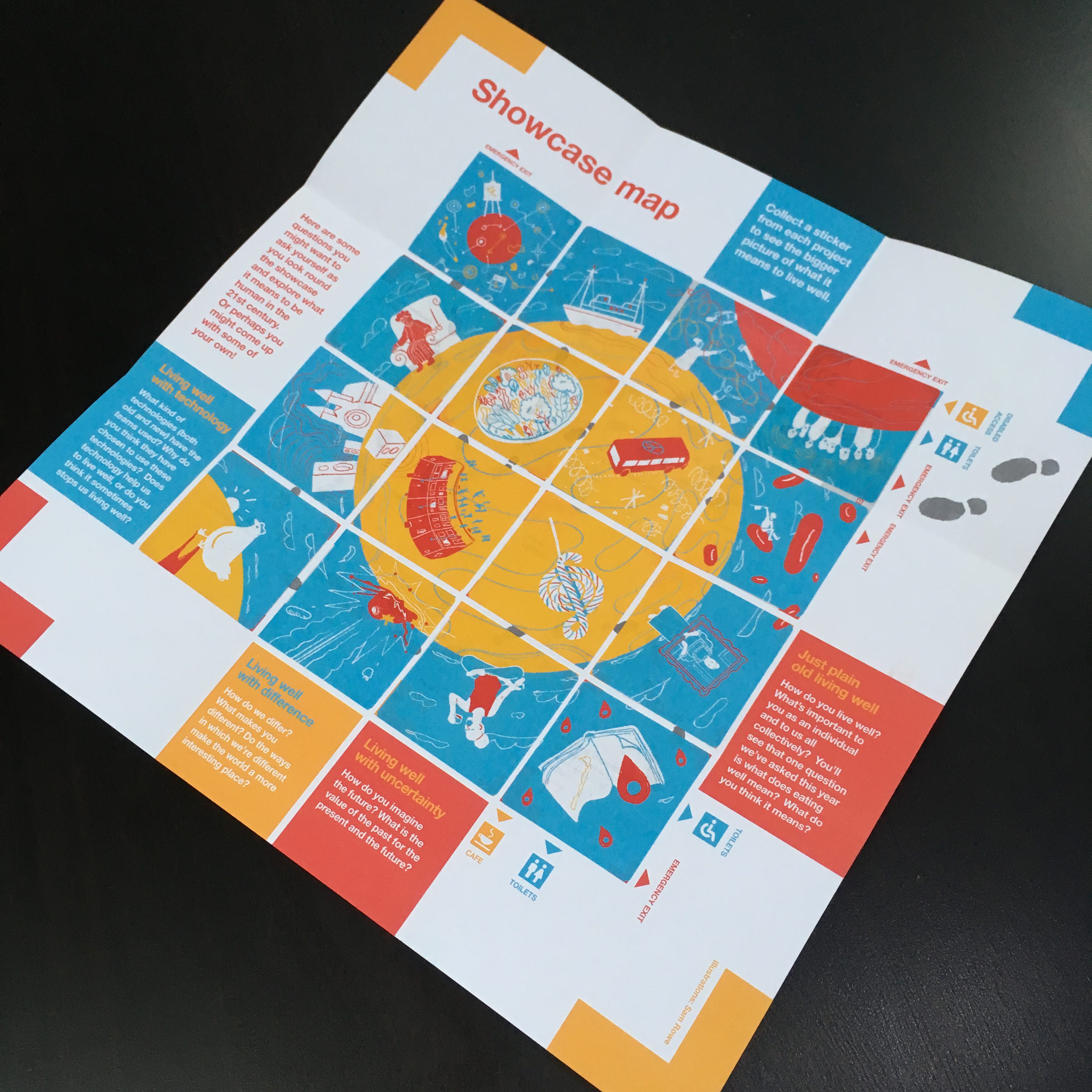
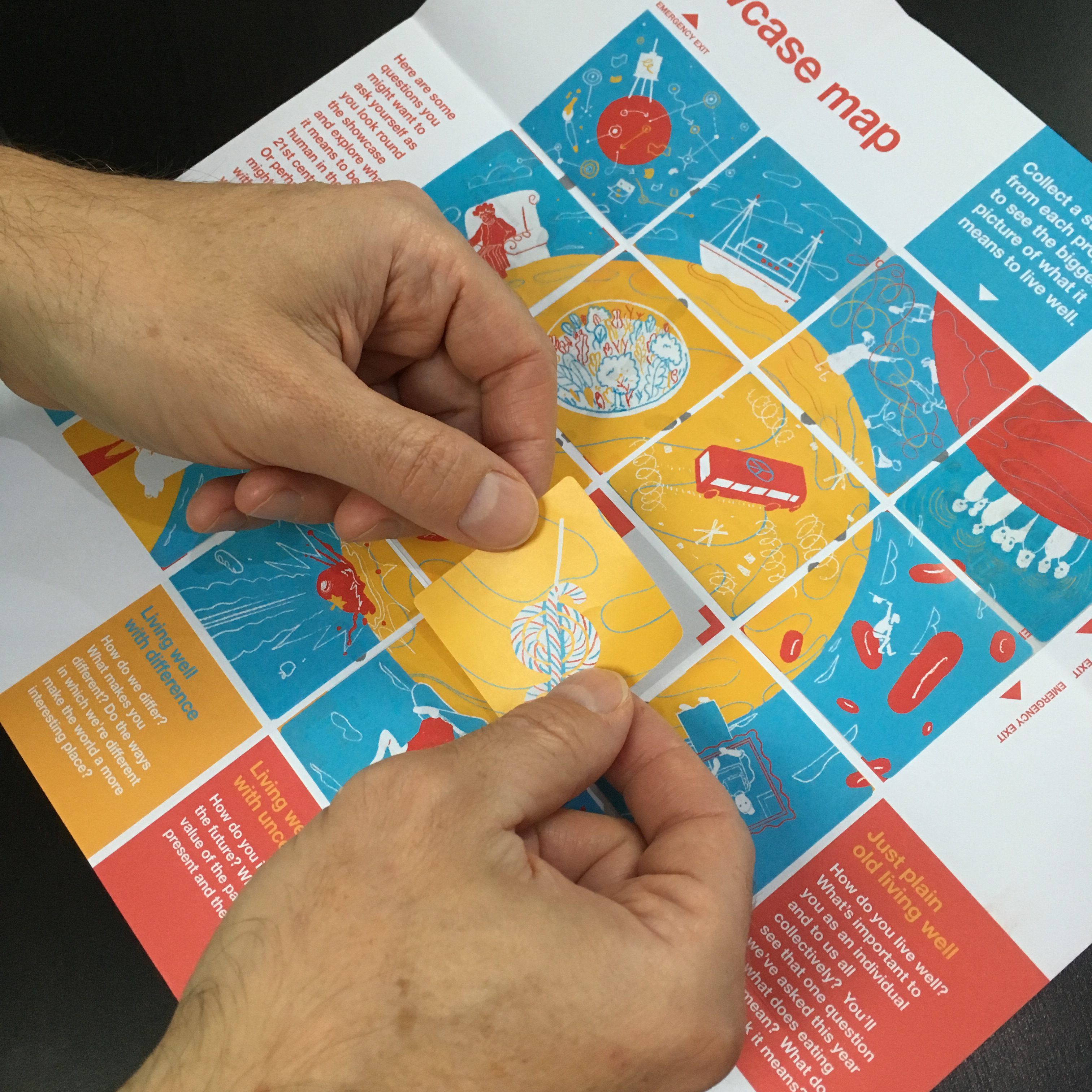
We collaborated with illustrator Sam Rowe to create images for stickers, which once complete created a bigger picture of the Brigstow world – where collaboration can lead to all kinds of extraordinary things. Sam also illustrated our previous work for Brigstow so it was great to continue with the same style he’d introduced last year. Each stall had a different sticker to collect which meant there was plenty of interaction between visitors and the different projects.
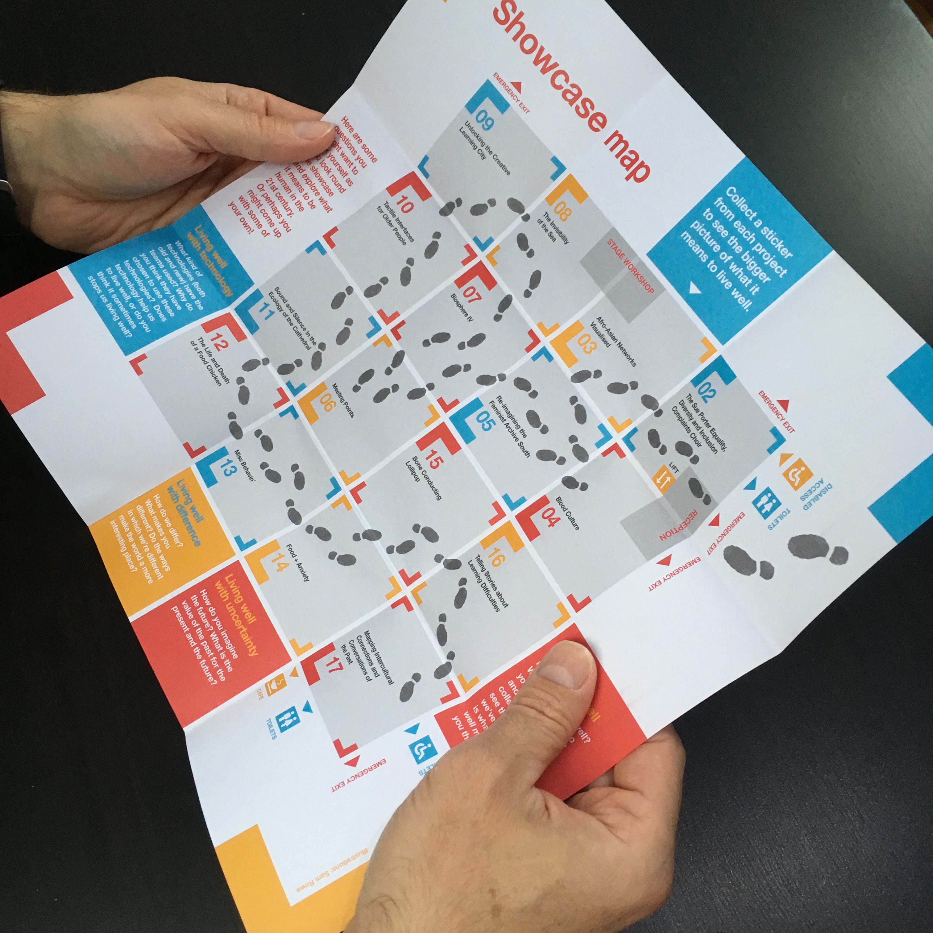
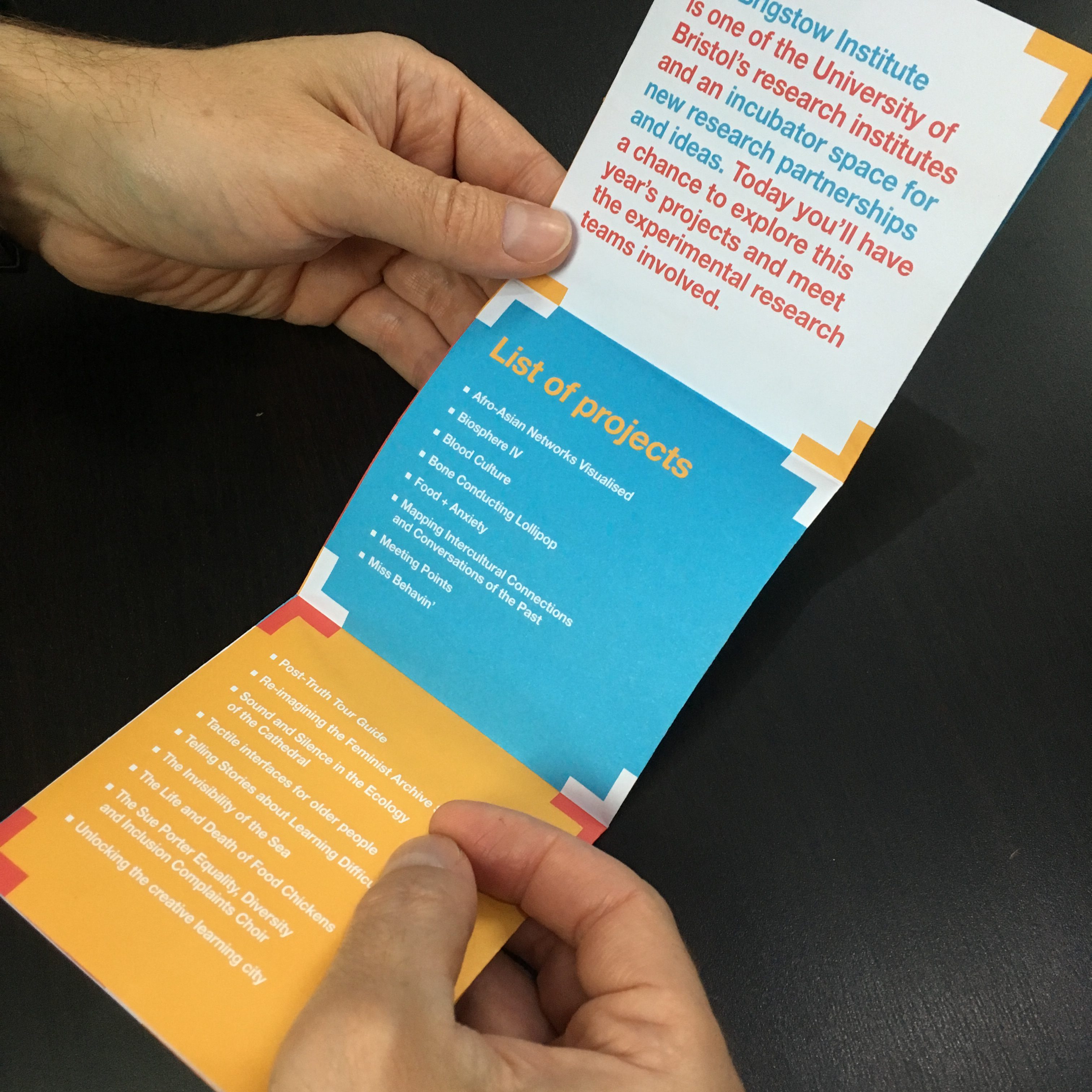
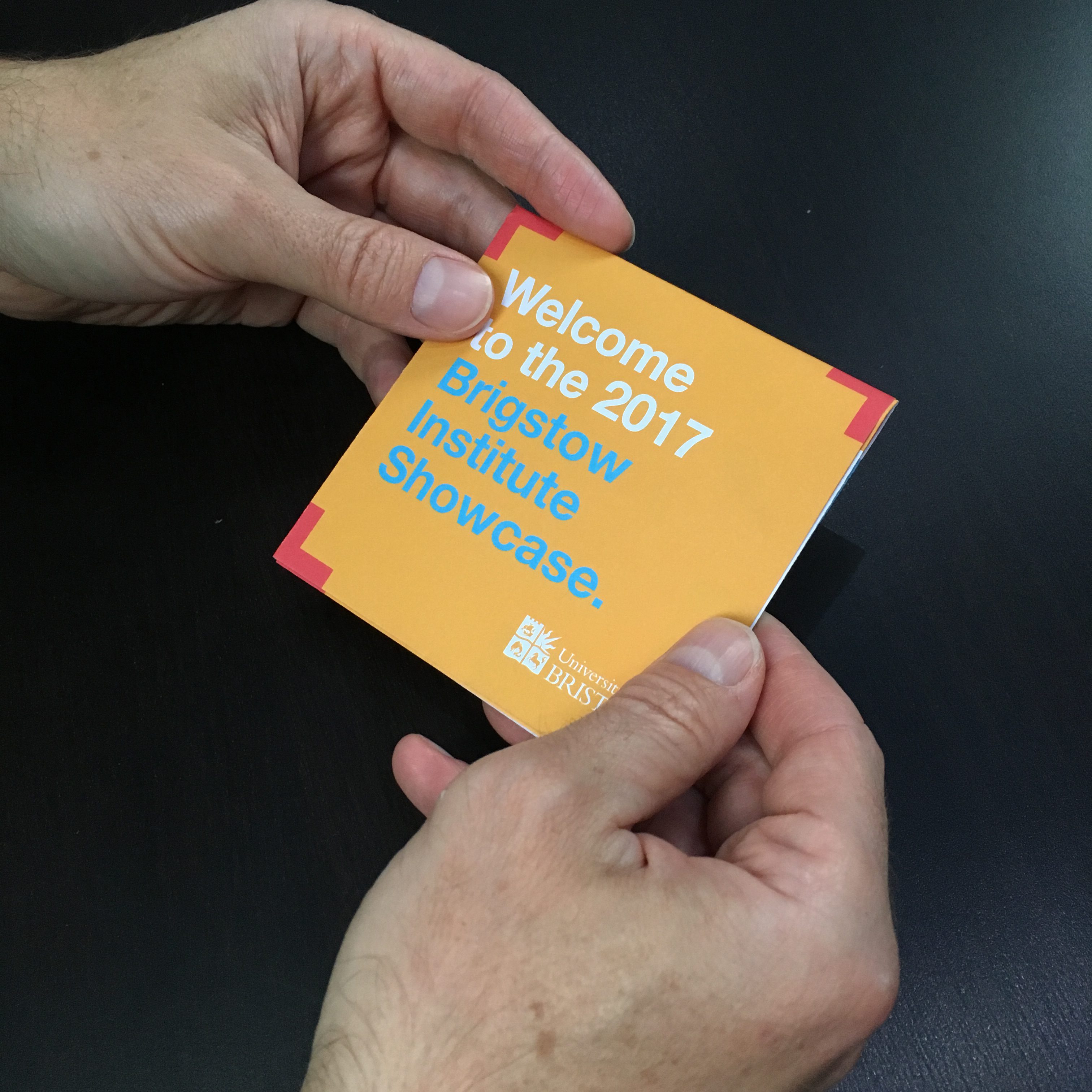
As well as a map for the showcase we created a pack of postcards as a record for each project showcased. These were placed inside a bespoke cardboard wallet to be shared out between individuals involved in the different projects. The material was made from 100% recycled cardboard and printed digitally using an indigo printer.
